This post will be covering the features and APIs of Radio Button, Checkbox and Switch components. To find out how to handle initial setup of Material Components for Android (including the Gradle dependency and creating an app theme), please see my original post:
Setting up a Material Components theme for Android
Attribute by attribute
medium.com
Selection Controls are small components for scenarios in which users need to select options or toggle settings. They are typically found on settings screens and dialogs.
From a design perspective, there are three main types of selection controls which can be used in different scenarios:
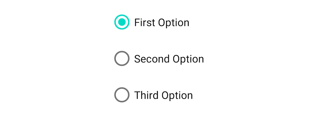
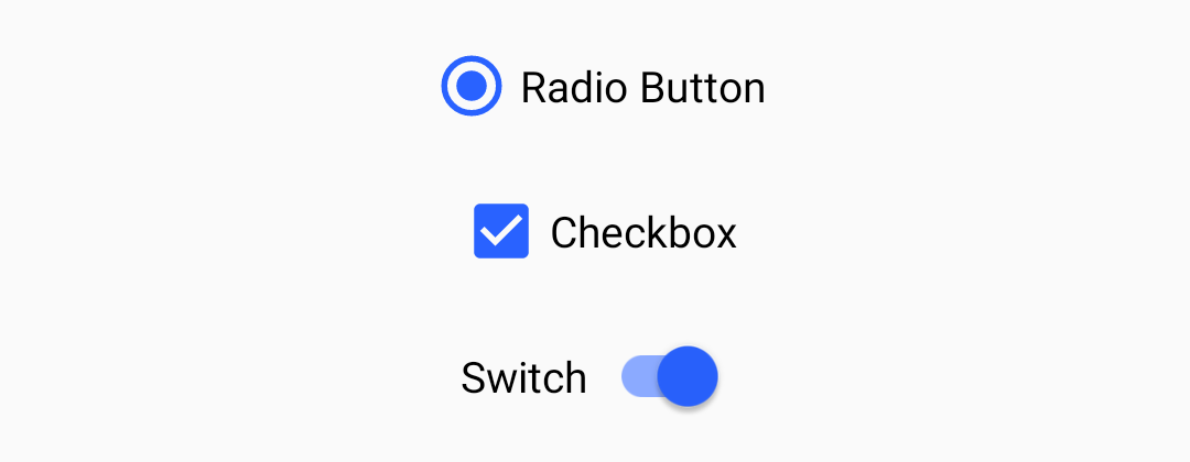
Radio Buttons: A circular control with two possible states; selected or unselected. Has single-select behavior when in a group of other radio buttons (i.e. Only one control can be selected at a time).
Checkboxes: A square control with two possible states; checked or unchecked. Has multi-select behavior when in a group of other checkboxes (i.e. Multiple controls can be selected at a time).
Switches: A control consisting of a thumb and a track. Has two possible states; on or off.
<LinearLayout
  ...>

  <com.google.android.material.radiobutton.MaterialRadioButton
    android:id="@+id/radioButton"
    android:layout_width="wrap_content"
    android:layout_height="wrap_content"
    android:text="Radio Button" />

  <com.google.android.material.checkbox.MaterialCheckBox
    android:id="@+id/checkbox"
    android:layout_width="wrap_content"
    android:layout_height="wrap_content"
    android:text="Checkbox" />  <!-- Note: ID cannot be 'switch' as this is a Java keyword -->
  <com.google.android.material.switchmaterial.SwitchMaterial
    android:id="@+id/switchMaterial"
    android:layout_width="wrap_content"
    android:layout_height="wrap_content"
    android:text="Switch" />

</LinearLayout>
Setting and listening for checks 👂
All of the selection controls extend from the base CompoundButton class. As such, they inherit a checkable behavior that can be toggled both programmatically and via touch interaction.
A selection control can be programmatically toggled:
Selection controls are commonly used in groups. Strictly speaking, any ViewGroup can be used to achieve this (eg. a RecyclerView). That being said, the RadioGroup class exists to specifically handle single-select behavior for MaterialRadioButtons.
MaterialRadioButtons grouped with RadioGroup
MaterialRadioButtons can be grouped with a RadioGroup like so:
A number of APIs exist for programmatically setting, getting and listening for changes to child MaterialRadioButton checked/unchecked state:
radioGroup.check(R.id.option1)
val checkedRadioButtonId = chipGroup.checkedRadioButtonId // Will return View.NO_ID if nothing checkedradioGroup.setOnCheckedChangeListener { group, checkedId ->
    // Handle child MaterialRadioButton checked/unchecked}
Theming 🎨
Selection controls can be themed in terms of the three Material Theming subsystems: color, typography and shape. When implementing global custom MaterialRadioButton, MaterialCheckBox and SwitchMaterial styles, reference them in your app theme with the radioButtonStyle, checkboxStyle and switchStyle attributes respectively.
Color
The color of selection controls defaults to colorOnSurface (unchecked) and colorControlActivated i.e. colorSecondary (checked) defined in your app theme. In order to override this on a per-control level, you will need to either:
Use a theme overlay with the above-mentioned color attributes present, applied to the widget with the android:theme attribute.
The text labels of the selection controls will adopt the fontFamily attribute defined in your app theme. In order to override this in a style or on a per-control level, use the android:textAppearance attribute.
Type theming
Shape
There are no aspects of any of the selection controls that can be adjusted with shape theming.
More and more Android apps are integratingDynamic Featuresinto their projects, although the fact that you need Play Store to deliver the features, makes it hard to test the real user flow (i.e user opening the app and installing a module after clicking somewhere).
Android Studio offers a way to select which Dynamic Features to include when running the app, although it doesn’t offer a way to test installation of the Dynamic Feature modules from Play.
Luckily, we havePlay Internal App Sharingwhich allows developers to upload versions of the app and quickly and easily share it with others for testing.
This means that to test the full flow, we must: build a bundle, upload it to Play Console Internal App Sharing, copy the upload link, open it on a device, then install the app to try it out.
There is a better way.
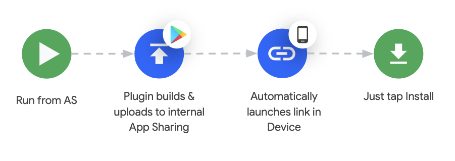
With the new version ofGradle Play Publisher, we can automate the flow above in one click/command.
serviceAccountCredentialsshould point to the Json file that contains the key for the service account you set inStep 2.
defaultToAppBundlesset this flag to true to tell the plugin to create app bundles by default (required for Dynamic features)
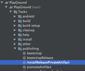
That’s it. You can run the“installReleasePrivateArtifact”from the console or directly from the Android Studio (Select it from Gradle tasks underapp > publishing).
The tasks will build an App Bundle, upload it to Play Internal App Sharing, and launch the Play Store internal app sharing page, pointingallconnected devices to the newly uploaded version.
You will still have to manually click into the update button and launch the app.
Using Debug or other variant builds
There is no task to upload debug or other variant builds yet(#619), thus if you want to use debug or any other variant builds you must configure the plugin a bit differently.
You have to set up theartifactDirand make the task depend on thebundle${Variant}task.
play {
    serviceAccountCredentials = file(“service-account-key.json”)
    defaultToAppBundles = true    // Defines the path to Debug bundles
    artifactDir = file(“build/outputs/bundle/debug”)
}afterEvaluate {
    tasks.named(“uploadReleasePrivateBundle”).configure {
        dependsOn(“bundleDebug”)
    }
}
With this setup when running“installReleasePrivateArtifact”it will always use the debug variant.
Demo
In the video below you can see it working. We launch the task, since there was no change from the last upload (for shortening the video), the plugin automatically launches the last internal app sharing URL to the connected device.
So, you’ve migrated your Android app to AndroidX and, in the process, have also switched to using Material Components for Android as opposed to the Design Support Library. Alternatively, perhaps you’re in the fortunate situation of starting an app from scratch and get to use these new libraries right away. In either case, the core widgets you incorporate into your app now mostly fall under the com.google.android.material package and bring with them a variety of new theme/style attributes.
This article will only cover the new global theme attributes and per-widget style attributes that are introduced. Given that the Theme.MaterialComponents themes extend the pre-existing Theme.AppCompat variants, they inherit all of their attributes (think colorAccent, colorControlNormal, etc.), which will not be covered.
Let’s begin!
Initial setup 🏗️
This is as simple as adding a single Gradle dependency to your app/module build.gradle file:
Material Components for Android is under active development. The initial 1.0.0 release was mostly just a port of the existing com.android.support.design classes over to the new com.google.android.material namespace. Following this have been independent feature releases and, at the time of writing, the latest version is 1.2.0-alpha05. You can track new releases on the GitHub repository.
Choosing a Material Components theme 🤔
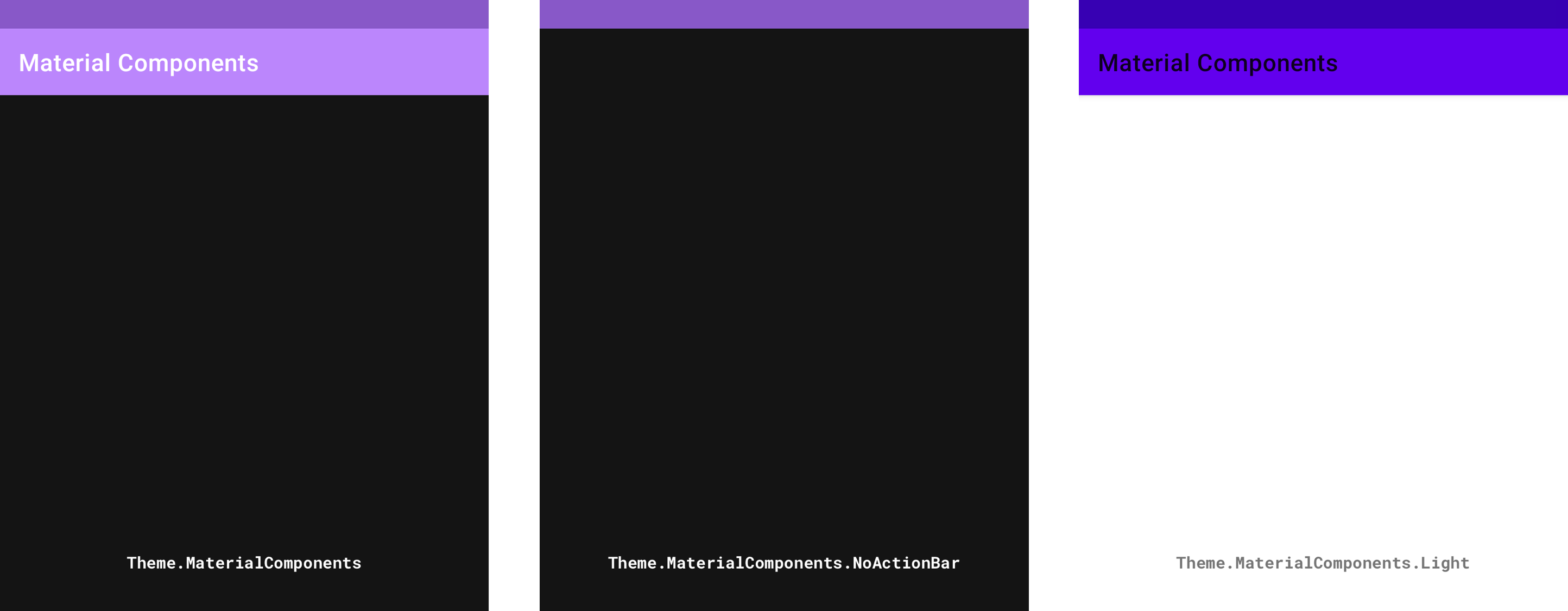
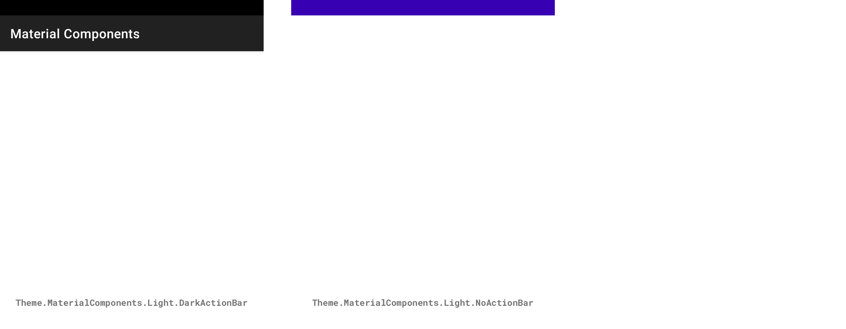
As with the AppCompat themes, the Material Components themes include a few base variants for you to choose from:
Material Components themes (from left to right): Theme.MaterialComponents, Theme.material components.NoActionBar, Theme.material components.Light
Material Components themes (from left to right): Theme.MaterialComponents.Light.DarkActionBar, Theme.MaterialComponents.Light.NoActionBar
The key differences in each variant are the light/dark color palettes and the inclusion/exclusion of an ActionBar in each themed Activity‘s Window. There exists DayNight variants of these for supporting automatic dark/light theming.
Note 1: If you are migrating an existing theme and don’t wish to get all of the new attributes at once, use a Theme.MaterialComponents.*.Bridge variant.
Note 2: Some secondary variants are not shown here, such as Theme.MaterialComponents.Dialog.* themes.
To start using one of these themes in your app, you’d add the following to your res/styles.xml file:
<style name="AppTheme" parent="Theme.MaterialComponents.*">
    <!-- Add attributes here --></style>
Finally, you need to reference this in your Manifest:
Note: You can also apply an android:theme per <activity> in your Manifest.
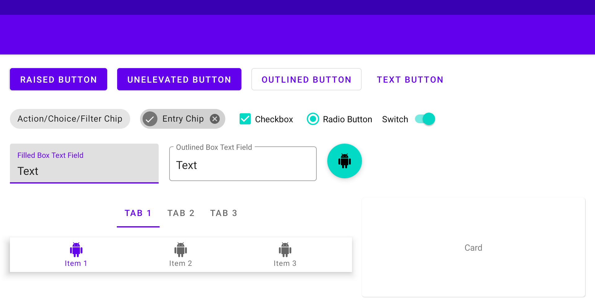
A simple playground screen 🎡
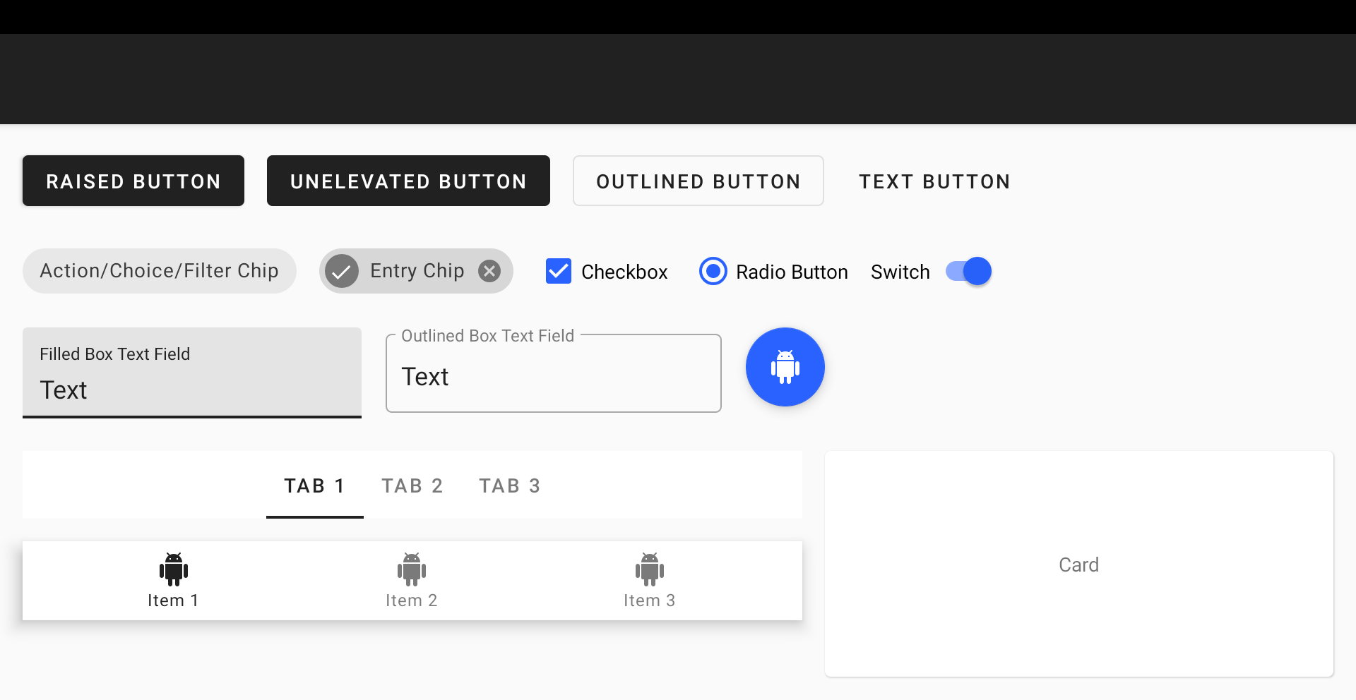
Right, time to get down to business. In order to illustrate the effects of customizing Material Components attributes, we need visual aid. We will be using the playground screen below, which uses the Theme.MaterialComponents.Light base theme and is packed with most Material Components widgets and their variants:
Playground screen
Global theme attributes 🌍
The Material Components themes introduce new attributes that can be used to style elements on a global scale. These can be grouped into three main subsystems: color, typography and shape.
Color
Color attributes consist mainly of primary, secondary, error, surface and background colors, along with their respective secondary variants and “on” colors. Some of these have been reused from the AppCompat themes (eg. colorPrimary, colorError and android:colorBackground):
colorPrimary: The primary brand color of your app, used most predominantly in theming
colorPrimaryVariant: A lighter/darker variant of your primary brand color, used sparingly in theming
colorOnPrimary: The color used for elements displayed on top of your primary colors (eg. Text and icons, often white or semi-transparent black depending on accessibility)
colorSecondary: The secondary brand color of your app, used mostly as an accent for certain widgets that need to stand out
colorSecondaryVariant: A lighter/darker variant of your secondary brand color, used sparingly in theming
colorOnSecondary: The color used for elements displayed on top of your secondary colors
colorError: The color used for errors (often a shade of red)
colorOnError: The color used for elements displayed on top of your error color
colorSurface: The color used for surfaces (i.e. Material “sheets”)
colorOnSurface: The color used for elements displayed on top of your surface color
android:colorBackground: The color behind all other screen content
colorOnBackground: The color used for elements displayed on top of your background color
These colors can be added to your app theme like so:
Note 1: Hex color codes are not currently supported for android:colorBackground, hence why a color resource was used.
Note 2: Use android:statusBarColor and android:navigationBarColor attributes to theme system bars.
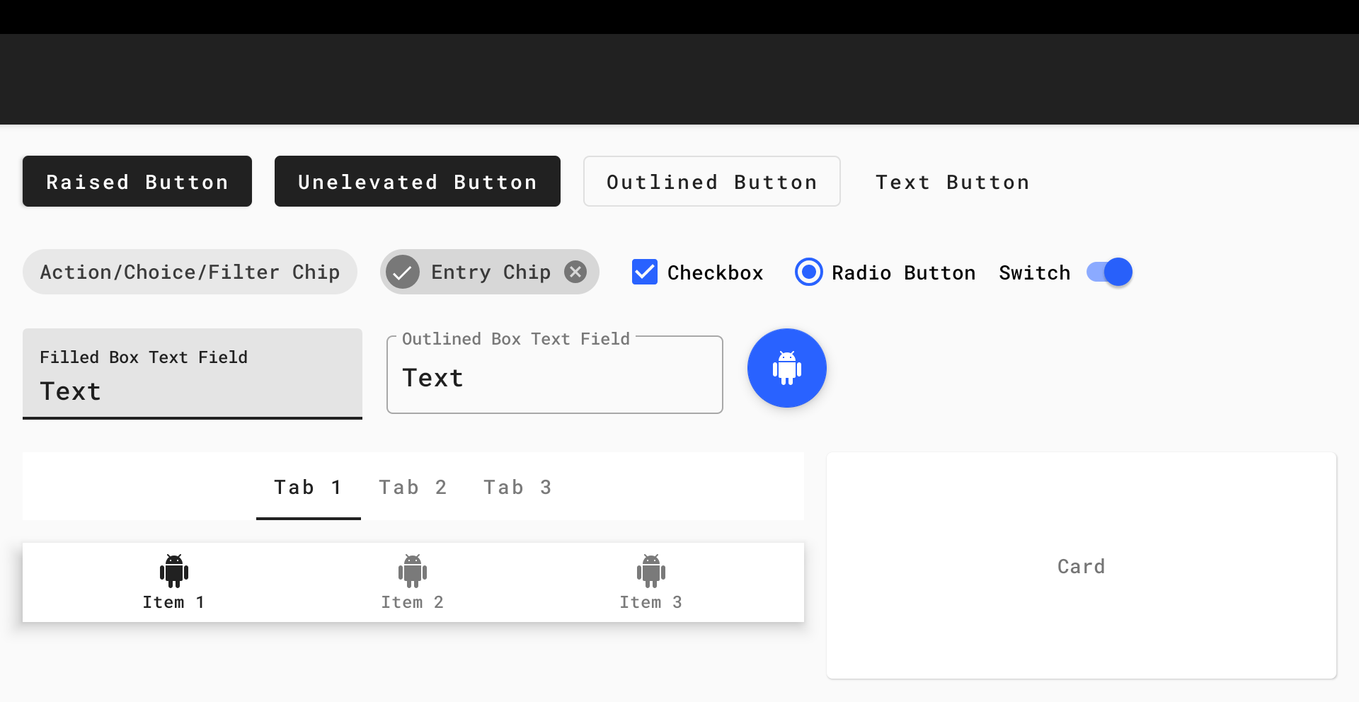
The result can be observed in our playground screen:
Playground screen with global color attributes customized
A great way to quickly preview the appearance of primary/secondary colors is to use the Material Color Tool.
Typography
Type attributes adhere to the Material Type System in terms of text typeface, weight, size, case and letter spacing. The attributes reference TextAppearance.MaterialComponents.* styles that implement (and are named after) the various type scales:
textAppearanceHeadline1: Light, 96sp
textAppearanceHeadline2: Light, 60sp
textAppearanceHeadline3: Regular, 48sp
textAppearanceHeadline4: Regular, 34sp
textAppearanceHeadline5: Regular, 24sp
textAppearanceHeadline6: Medium, 20sp
textAppearanceSubtitle1: Regular, 16sp
textAppearanceSubtitle2: Medium, 14sp
textAppearanceBody1: Regular, 16sp
textAppearanceBody2: Regular, 14sp
textAppearanceCaption: Regular, 12sp
textAppearanceButton: Regular, 14sp, all caps
textAppearanceOverline: Regular, 12sp, all caps
The Material Components widgets will use these styles as per the Material guidelines.
You would typically want to keep the default weight, size, case and letter spacing for each style. However, a custom typeface can really make your app stand out. One might assume this requires overriding each and every one of these attributes. Thankfully, this can be done in a far more concise way by adding the following attributes to your app theme:
These attributes reference an XML Font or a Downloadable Font that you’ve added to your res/font folder and will apply a custom typeface to every widget and text style in your app. There was certainly a time when it wasn’t this easy on Android!
If you do, however, wish to customize one of the Material Components text appearance styles, you would do so like this:
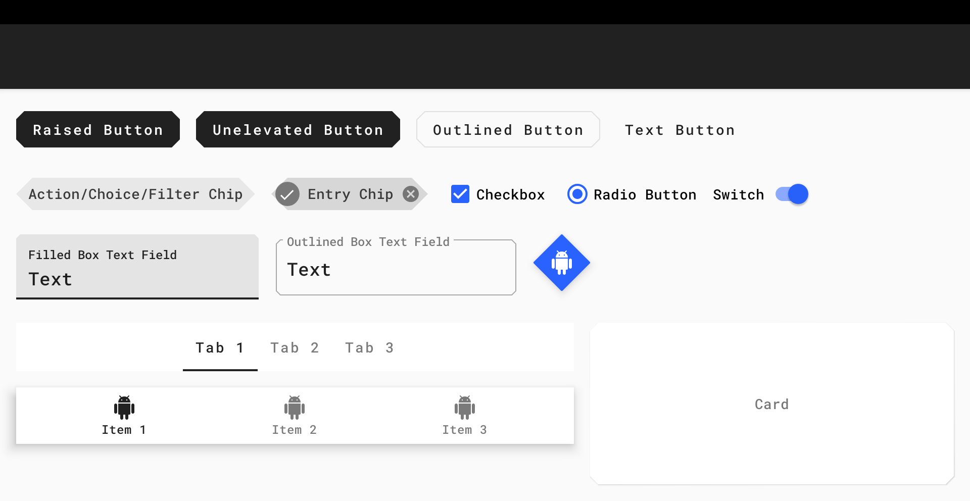
The results can be observed in our playground screen:
Playground screen with global type attributes customized
Lastly, Google Fonts is a great place to start if you’re looking for free-to-use, custom typefaces (which happen to work really well with Downloadable Fonts too).
Shape
Shape attributes refer to the general form of each surface and widget in your app. When you consider that these components can be of varying width/height and be raised/unelevated/outlined, this reduces down to one aspect of customization… Corners.
Material Components corners can either be part of the rounded (default) or cutcornerFamily and have a cornerSize to customize the size. A treatment can be applied to all corners or a subset. The shape theme attributes reference ShapeAppearance.MaterialComponents.* styles:
shapeAppearanceSmallComponent: For small components, such as Buttons and Chips
shapeAppearanceMediumComponent: For medium components, such as Cards
shapeAppearanceLargeComponent: For large components, such as Bottom Sheets
The Material Components widgets will use these styles as per the Material guidelines.
If you wish to customize the Material Components shape appearance styles, you would do so like this:
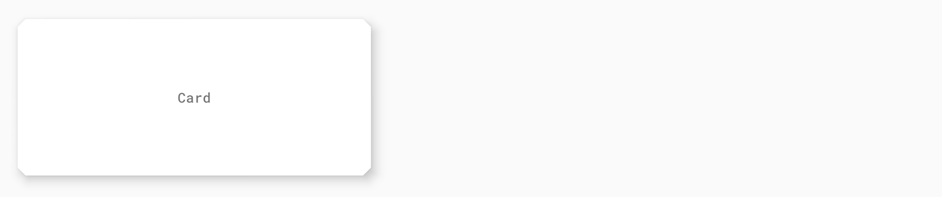
The result can be observed in our playground screen:
Playground screen with global shape attributes customized
Widget styles and attributes 📱
While global theming covers the majority of our needs, there are times when we may wish to customize the attributes of individual widgets. We will explore the styles (and relevant attributes) of common widgets and how these can be referenced in your Material Components theme.
Buttons
Material Buttons include four main variants that all inherit from the base Widget.MaterialComponents.Button style, each with an optional style suffix: raised (default, no suffix), unelevated (*.UnelevatedButton), outlined (*.OutlinedButton) and text (*.TextButton). All button variants use the textAppearanceButton theme attribute for their typography styles.
The key attributes for customizing these styles are as follows:
backgroundTint: The tint color applied to the button background. The default enabled color is transparent for text buttons and colorPrimary for all other variants.
iconTint: The tint color applied to an optional button icon. The default enabled color is colorPrimary for text buttons and colorOnPrimary for all other variants.
rippleColor: The color of the button touch ripple. The default color is colorOnPrimary for raised/unelevated buttons and colorPrimary for outlined/text buttons.
strokeColor: The color of the stroke around the button background. The default color is colorOnSurface for outlined buttons and transparent for all other variants.
strokeWidth: The width of the stroke around the button background. The default value is 1dp for outlined buttons and 0dp for all other variants.
shapeAppearance: The shape appearance of the button background. The default value is shapeAppearanceSmallComponent.
The base button style (used by the MaterialButton widget class) can be customized and applied globally like so:
The result can be observed in our playground screen:
Customized Button widget styles
Text Fields
Material Text Fields include two main variants. As a result of porting the pre-existing AppCompat TextInputLayout and TextInputEditText classes, there are in fact two base styles: Widget.MaterialComponents.TextInputLayout.* and Widget.MaterialComponents.TextInputEditText.*. The variants have a style suffix and include filled box (default, *.FilledBox) and outlined box (*.OutlinedBox). All text field variants use the standard text appearance for input and the textAppearanceCaption theme attribute for “helper” text (labels, errors, counters, etc.).
The key attributes for customizing the Widget.MaterialComponents.TextInputLayout.* styles are as follows:
boxBackgroundMode: The mode of the box background, which can be either filled, outline or none.
boxBackgroundColor: The color of the text field background. The default enabled color is colorOnSurface for filled box text fields and transparent for outlined box text fields.
boxStrokeColor: The color of the stroke around the text field background. The default color is colorOnSurface (in default state) for outlined box text fields and is ignored for filled box text fields.
hintTextColor/errorTextColor/counterTextColor: Various colors for different “helper” text sub-components.
shapeAppearance: The shape appearance of the text field background. The default value is shapeAppearanceSmallComponent.
The base text field style (used by the TextInputLayout widget class) can be customized and applied globally like so:
Note: text_field_background is a res/color<selector> that uses colorSecondary and the same alpha values as the defaultboxBackgroundColor<selector>.
The result can be observed in our playground screen:
Customized Text Field widget styles
Cards
Material Cards are considered to be “surfaces” and make use of the Widget.MaterialComponents.CardView style. The key attributes for customizing them are as follows:
cardBackgroundColor: The color of the card background. The default color is colorSurface.
cardElevation: The elevation of the card. The default value is 1dp.
shapeAppearance: The shape appearance of the card background. The default value is shapeAppearanceMediumComponent.
The base card style (used by the MaterialCardView widget class) can be customized and applied globally like so:
The result can be observed in our playground screen:
Customized Card widget style
Bottom Navigation
Material Bottom Navigation includes two main variants that inherit from the base Widget.MaterialComponents.BottomNavigationView style, with an optional style suffix: surface (default, no suffix) and colored (*.Colored). Bottom Navigation labels use the textAppearanceCaption theme attribute for their typography styles.
The key attributes for customizing these styles are as follows:
backgroundTint: The color of the bottom navigation background. The default color is colorSurface for surface bottom navigation and colorPrimary for colored bottom navigation.
itemTextColor/itemIconTint: The colors of bottom navigation item icons and labels. The default colors are colorOnSurface/colorPrimary(selected) for surface bottom navigation and colorOnPrimary for colored bottom navigation.
itemHorizontalTranslationEnabled: A flag to set whether or not a translation animation should occur when selecting bottom navigation items. The default value is false.
The base bottom navigation style (used by the BottomNavigationView widget class) can be customized and applied globally like so:
The result can be observed in our playground screen:
Customized Bottom Navigation widget style
This is certainly not exhaustive. A more comprehensive list of all components and their attributes can be found in the Material Components for Android Docs.
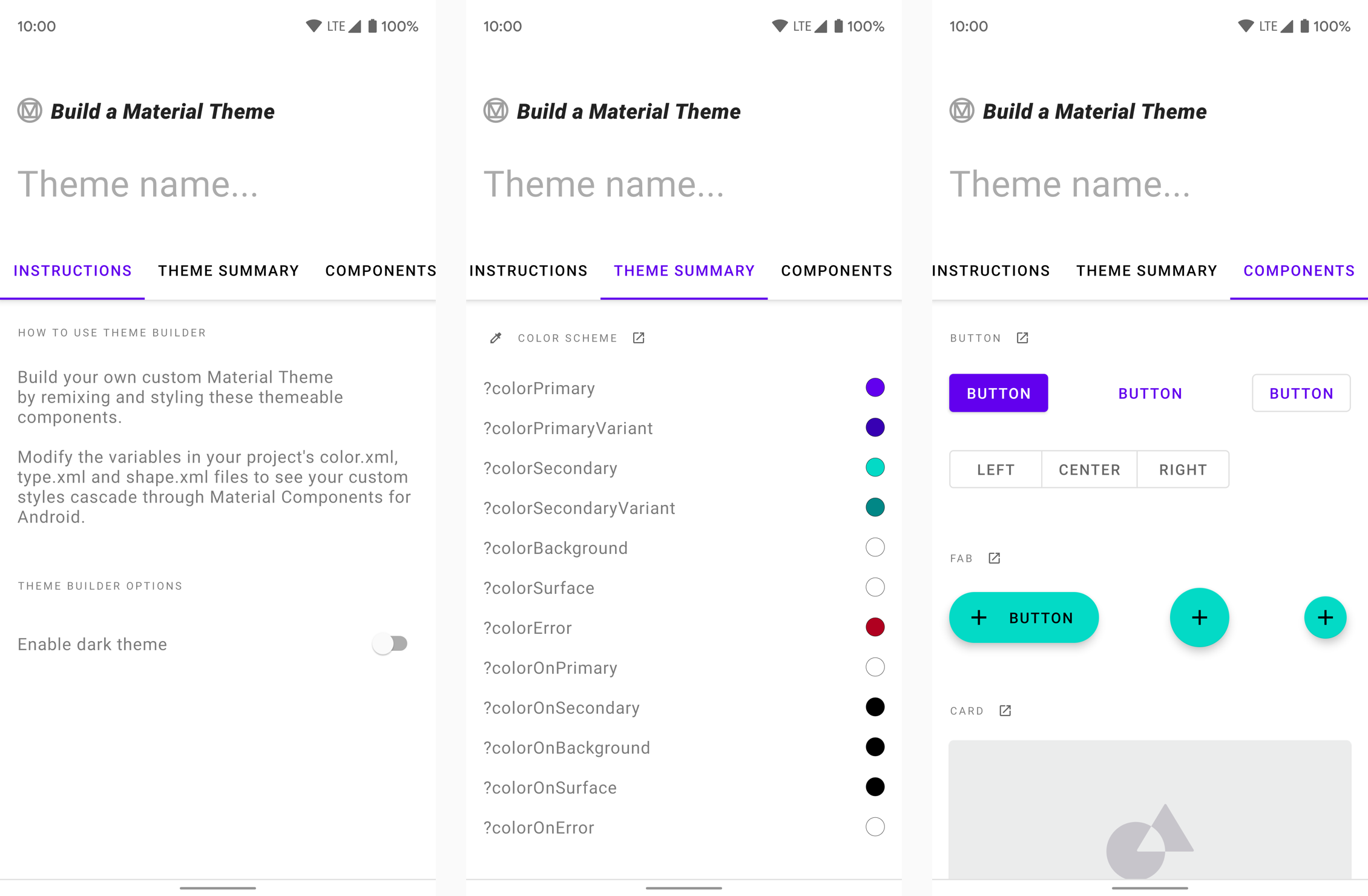
Build a Material Theme
The Material Components for Android library includes a module that allows you to easily customize an existing Material Theme. It provides you with a set of XML files (color.xml/night/color.xml, type.xml and shape.xml) which include all of the necessary baseline theme attributes mentioned in this article. The values can be tweaked and previewed in a corresponding sample app. When you’re happy with the chosen values, the files can be dropped into a new/existing Android Studio project. A web version is also available on Glitch.
The “Build a Material Theme” sample app
More resources 📚
The source code for the Playground app used in this article can be found on GitHub
“The Components of Material Design” - A great presentation by Cameron Ketcham and Gautham Sajith at Android Dev Summit 2018, covering a brief history of Material Design and how to use Material Components for Android
I hope this post has provided some insight into theming your app using Material Components for Android. If you have any questions, thoughts or suggestions then I’d love to hear from you!