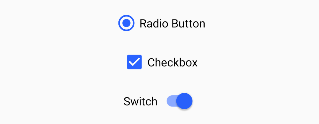
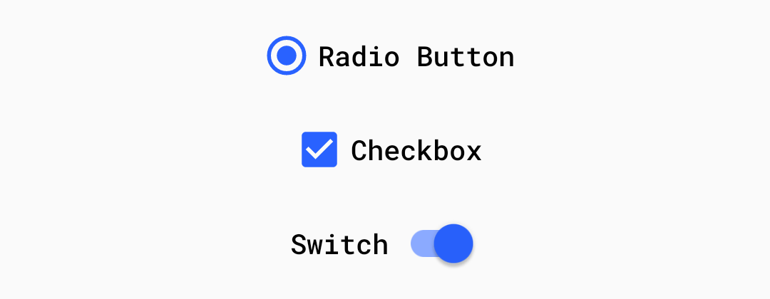
This post will be covering the features and APIs of Radio Button, Checkbox and Switch components. To find out how to handle initial setup of Material Components for Android (including the Gradle dependency and creating an app theme), please see my original post:
Setting up a Material Components theme for Android
Attribute by attribute
medium.com
Selection Controls are small components for scenarios in which users need to select options or toggle settings. They are typically found on settings screens and dialogs.
From a design perspective, there are three main types of selection controls which can be used in different scenarios:
- Radio Buttons: A circular control with two possible states; selected or unselected. Has single-select behavior when in a group of other radio buttons (i.e. Only one control can be selected at a time).

- Checkboxes: A square control with two possible states; checked or unchecked. Has multi-select behavior when in a group of other checkboxes (i.e. Multiple controls can be selected at a time).

- Switches: A control consisting of a thumb and a track. Has two possible states; on or off.

Basic usage 🏁
<LinearLayout
  ...>

  <com.google.android.material.radiobutton.MaterialRadioButton
    android:id="@+id/radioButton"
    android:layout_width="wrap_content"
    android:layout_height="wrap_content"
    android:text="Radio Button" />

  <com.google.android.material.checkbox.MaterialCheckBox
    android:id="@+id/checkbox"
    android:layout_width="wrap_content"
    android:layout_height="wrap_content"
    android:text="Checkbox" />  <!-- Note: ID cannot be 'switch' as this is a Java keyword -->
  <com.google.android.material.switchmaterial.SwitchMaterial
    android:id="@+id/switchMaterial"
    android:layout_width="wrap_content"
    android:layout_height="wrap_content"
    android:text="Switch" />

</LinearLayout>
Setting and listening for checks 👂
All of the selection controls extend from the base
CompoundButton class. As such, they inherit a checkable behavior that can be toggled both programmatically and via touch interaction.
A selection control can be programmatically toggled:
radioButton.isChecked = truecheckbox.isChecked = trueswitchMaterial.isChecked = true
Listening for checked/unchecked state changes is done like so:
radioButton.setOnCheckedChangeListener { radioButton, isChecked ->
    // Handle radio button checked/unchecked}checkbox.setOnCheckedChangeListener { checkbox, isChecked ->
    // Handle checkbox checked/unchecked}switchMaterial.setOnCheckedChangeListener { switch, isChecked ->
    // Handle switch checked/unchecked}
Grouping Selection Controls 👨👩👧👦
Selection controls are commonly used in groups. Strictly speaking, any
ViewGroup can be used to achieve this (eg. a RecyclerView). That being said, the RadioGroup class exists to specifically handle single-select behavior for MaterialRadioButtons.
MaterialRadioButtons can be grouped with a RadioGroup like so:<RadioGroup
android:id="@+id/radioGroup"
android:layout_width="wrap_content"
android:layout_height="wrap_content"
android:orientation="vertical">
<com.google.android.material.radiobutton.MaterialRadioButton
android:id="@+id/option1"
android:layout_width="wrap_content"
android:layout_height="wrap_content"
android:text="First Option" />
<com.google.android.material.radiobutton.MaterialRadioButton
android:id="@+id/option2"
android:layout_width="wrap_content"
android:layout_height="wrap_content"
android:text="Second Option" />
...
</RadioGroup>
A number of APIs exist for programmatically setting, getting and listening for changes to child
MaterialRadioButton checked/unchecked state:radioGroup.check(R.id.option1)
val checkedRadioButtonId = chipGroup.checkedRadioButtonId // Will return View.NO_ID if nothing checkedradioGroup.setOnCheckedChangeListener { group, checkedId ->
// Handle child MaterialRadioButton checked/unchecked}
Theming 🎨
Selection controls can be themed in terms of the three Material Theming subsystems: color, typography and shape. When implementing global custom
MaterialRadioButton, MaterialCheckBox and SwitchMaterial styles, reference them in your app theme with the radioButtonStyle, checkboxStyle and switchStyle attributes respectively.Color
The color of selection controls defaults to
colorOnSurface (unchecked) and colorControlActivated i.e. colorSecondary (checked) defined in your app theme. In order to override this on a per-control level, you will need to either:- Use a theme overlay with the above-mentioned color attributes present, applied to the widget with the
android:themeattribute. - Set the
useMaterialThemeColorsattribute to false and apply a custom tintColorStateListusingCompoundButtonCompat#setButtonTintList.

Typography
The text labels of the selection controls will adopt the
fontFamily attribute defined in your app theme. In order to override this in a style or on a per-control level, use the android:textAppearance attribute.
Shape
There are no aspects of any of the selection controls that can be adjusted with shape theming.


