DISCLAIMER: The title is misleading and possibly not true, but you will definitely get the required tools to do what it says... eventually. Now to the post:
While learning how to create a library and have it ready to use for any android project out there, I learned the steps involved in the process and became aware of how easy it actually is to go from your library idea to this magic one-liner:

So I decided to share the basic steps to take into account for mostly creating your own library and sharing your library with everyone.
In a nutshell you will have to:
- Create a new Android App that showcases your library
- Create your own Android Library
- Publish your library to Github
- Setup to share with any other android project through Jitpack
Create a new Android App
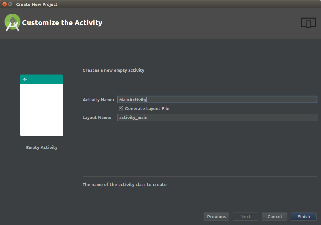
First thing you’ll need is a freshly created new Android Project, where you’ll be testing and later showcasing your new library.

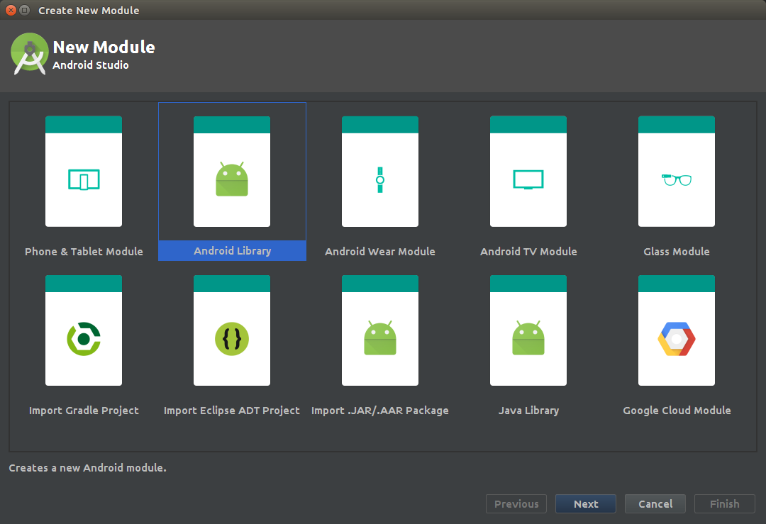
Create a new Android Library
Once your project is ready and running, you’ll have to add a new local library:
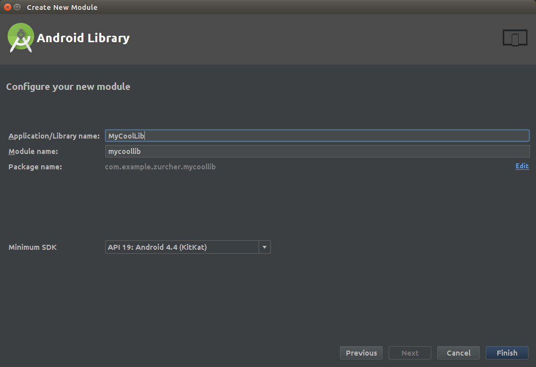
Right-click your project new -> module and select ‘Android Library’


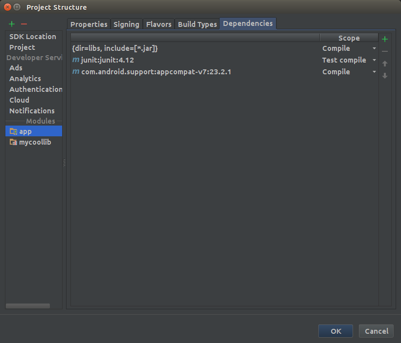
Once created: add the new module as a dependency of your project. Go to File -> Project Structure, click on your project module, select the Dependencies tab, use the (+) sign to add a new module dependency:

Select your newly created library:

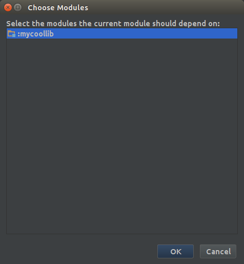
That should automatically add the dependency to your app/build.gradle file:
compile project(':mycoollib')
At this point we have our library created and our example project configured to use it, we are only missing one thing: our library is as useful as a motorcycle’s ashtray. Add some code to your library.
As an example we’ll create a library that calculates the distance in KM between any valid Latitude/Longitude pair values (which despite sounding useless I have found this useful in the past), the first thing we’ll need in our lib is a Point Class which will represent the map points:
Next we’ll add the main class of our library which has the logic for the calculation of kilometers:
Naturally I didn’t figure out that equation myself, instead this site gave me the answer and yes that’s the radius of the earth in kilometers.
Our library structure at this point should look like this:
// This path will vary depending on the name you gave to it
com.example.zurcher.mycoollib
 |---LatLonDistanceCalculator.java
 |---Point.java
Now we have our library ready to calculate the distance between two latitude/longitude points and return a float with the answer, the next step is to USE our library in our example project. Well add this code to our example android app onCreate method:
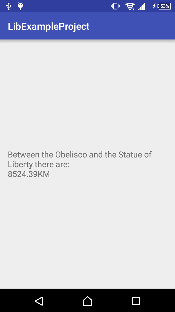
What we do here is create two Point objects (that are of the class type we created previously in our library) that represent the coordinates of the Buenos Aires Obelisco and NYC’s Statue of Liberty.
We perform the call to our library passing as parameters the points and we show the result in a TextView in the UI (I know it is not the best way but this is a tutorial about libraries and not TextView best practices).
The final result should look like this:

You can find a working example of the source code here.
Publish to Github
Finally, our app is ready and running, it serves a humble purpose, but it works like a charm. What we need now is to make it available for anyone (both coders and IT recruiters :wink:) to do so, we need to upload our code to Github.
Init a git repository in your project’s root (in case you weren’t already tracking local changes with git which is an excellent practice.)
If you don’t have git installed go hereIf you never used git but somehow you installed it anyway do this
If git is ready to use then go to your project’s root folder (where your *.iml file is) and run the following commands:
~/Path/To/Your/Project/Root/Folder $ git init
~/Path/To/Your/Project/Root/Folder $ git add .
~/Path/To/Your/Project/Root/Folder $ git commit -m "Initial Commit"
Just by doing that you are tracking your project locally with git.
If you reach this point and you’re wondering ‘what on earth is git?!’ just chill and go here
Now that your project is ‘git-ready’ you can upload it to Github. To do so we’ll have to create it on Github here, add a name to your library (Tip: use a simple-lowercase name since this will be used in the compile dependency line) and set its visibility to public so everyone may check your work and even extend it later.
Now your repository is created, but still empty, so the next step is uploading our library to Github. Follow the steps suggested by Github in your new repository under the section called: ‘…or push an existing repository from the command line’
Go to your project’s root folder (exactly were you ran earlier the git init command) and run:
// Replace User with your Github username and Repo with your new repository namegit remote add origin https://github.com/User/Repo.git
git push -u origin master
Voilá! Check your repository at Github, it should have your changes now.
Setup Jitpack
Jitpack will let you share your library with anyone just adding the dependency of your library to their projects. All you have to do is a minimum setup to your library, as found in it’s Jitpack Android Documentation page.
- Update your project/build.gradle file adding the following classpath:
buildscript {
 dependencies {
  classpath 'com.github.dcendents:android-maven-gradle-plugin:2.1'
- Update your library module/build.gradle
// Add this below the first apply plugin of your file replacing 'YourUsername' with your Github usernameapply plugin: 'com.github.dcendents.android-maven' group='com.github.YourUsername'
- Create a release TAG in git
In your project’s root create tag replacing v1.4 for your desired version:
git tag -a v1.4 -m “my version 1.4”
git push origin v1.4
- Check that you have the gradle wrapper in your repository, otherwise create it and commit:
Run from project root:
gradle wrapper
- When all is setup and uploaded to Github, go to this jitpack url:
// Replace 'User' with your Github username, and 'Repo' with your library repo namehttps://jitpack.io/#User/Repo
And select the release you would like to share clicking the ‘Get It’ button next to the list of releases of your repository.
Add a beautiful README
Github automatically looks up for a file named ‘README.md’ at the root of your repository and displays it below. This file is important because it’s the entry point of any developer to your library and the first thing they’ll see when reaching your repository in need of (in this case) a fantastic tool to calculate the distance between any given pair of latitude/longitude points.
What your README.md file should include at minimum is:
- A badge with the status of your library repository (so anyone knows if it will work when they use it in their project). Go here to Badges section.
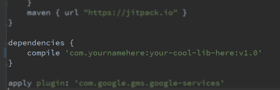
- A line providing an example of how should anyone add the library to its project. So anyone knows where to copy/paste to avoid rewriting your library code. In our case something like this:
repositories {
    jcenter()
    maven { url “https://jitpack.io” }
}dependencies {
    compile 'com.github.jitpack:gradle-simple:1.0'
}
- A nice screenshot showing how powerful is your library and how beautiful it looks when it works (avoid adding photos of how it looks when it’s not working).
- A “how to use” example code displaying how in only one line of code you handle all the boilerplate code with your library:
Point buenosAiresObeliscoPoint = new Point((float) -34.6037389, (float) -58.3815704);

Point nycStatueOfLibertyPoint = new Point((float) 40.6892494, (float) -74.0445004);

float distanceBetweenPoints = LatLonDistanceCalculator.calculateDistance(
                buenosAiresObeliscoPoint,
                nycStatueOfLibertyPoint);
- Finally, your library usage license (which can be included by default at the Github repository creation step), the most common scenario is that you want anyone to use it so adding an Apache 2.0 license (unless you’re a lawyer go here to check out what are you giving away) would be the best:
Copyright 2016 Alejandro Zürcher Licensed under the Apache License, Version 2.0 (the “License”); you may not use this file except in compliance with the License. You may obtain a copy of the License at http://www.apache.org/licenses/LICENSE-2.0 Unless required by applicable law or agreed to in writing, software distributed under the License is distributed on an “AS IS” BASIS, WITHOUT WARRANTIES OR CONDITIONS OF ANY KIND, either express or implied. See the License for the specific language governing permissions and limitations under the License.
- If you want to get cool examples about how to create a compelling README github file check how the cool kids do it:
Retrofit (Right to the point, no UI fancy colors here)ButterKnife (Are you using this? You should)SpotifyWebApiAndroid (If your android app needs Spotify it actually needs this)
Ready? Spread the word!
Last but not least, no one will use your library unless they know that exists so when your library is ready to use, super fancy and bug free (maybe just ‘ready to use’ is enough) start submitting your library through the channels used by android developers that will potentially use your library:
And why not?: creating a medium post sharing your experience and what you learned in the process that may help others create new libraries ;)
If you reached here: thank you! and feel free to destroy my post with your comments, I’ll review them plunged into hatred but will update logical suggestions.