So, you’ve migrated your Android app to AndroidX and, in the process, have also switched to using Material Components for Android as opposed to the Design Support Library. Alternatively, perhaps you’re in the fortunate situation of starting an app from scratch and get to use these new libraries right away. In either case, the core widgets you incorporate into your app now mostly fall under the
com.google.android.material package and bring with them a variety of new theme/style attributes.
This article will only cover the new global theme attributes and per-widget style attributes that are introduced. Given that the
Theme.MaterialComponents themes extend the pre-existing Theme.AppCompat variants, they inherit all of their attributes (think colorAccent, colorControlNormal, etc.), which will not be covered.
Let’s begin!
Initial setup 🏗️
This is as simple as adding a single Gradle dependency to your app/module
build.gradle file:implementation "com.google.android.material:material:$material_version"
Material Components for Android is under active development. The initial
1.0.0 release was mostly just a port of the existing com.android.support.design classes over to the new com.google.android.material namespace. Following this have been independent feature releases and, at the time of writing, the latest version is 1.2.0-alpha05. You can track new releases on the GitHub repository.Choosing a Material Components theme 🤔
As with the AppCompat themes, the Material Components themes include a few base variants for you to choose from:

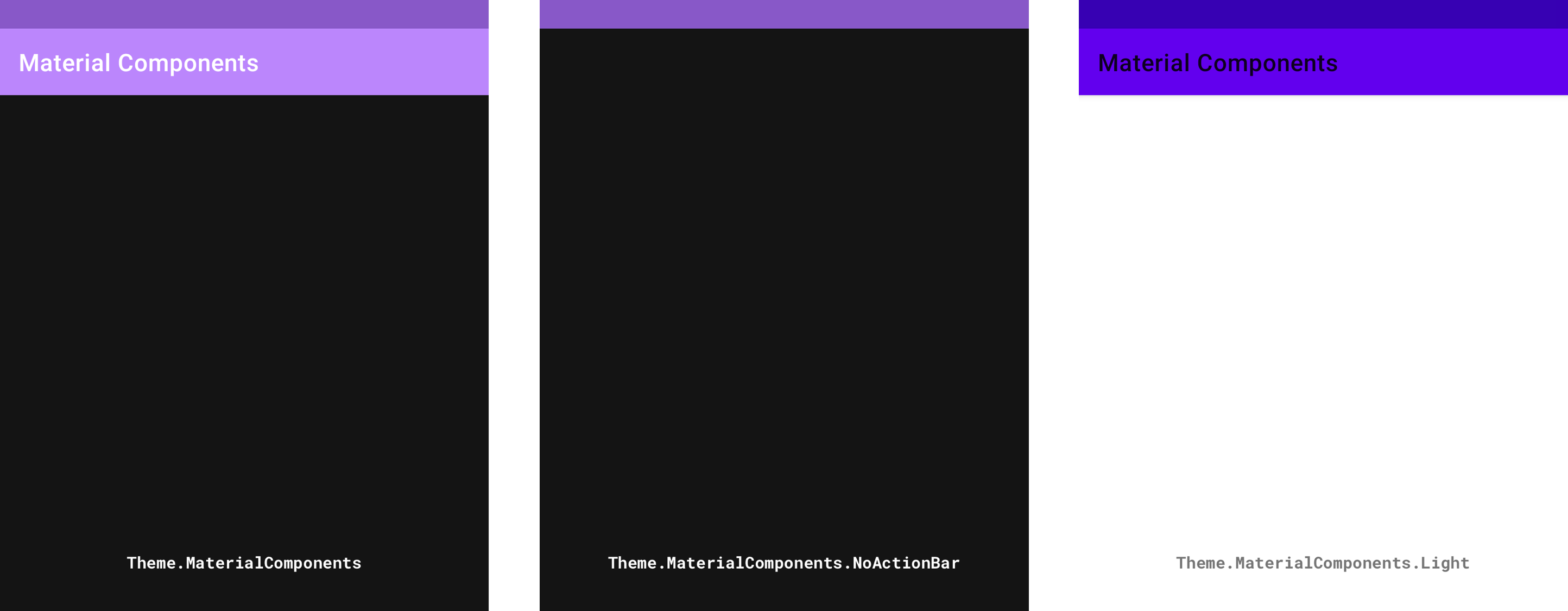

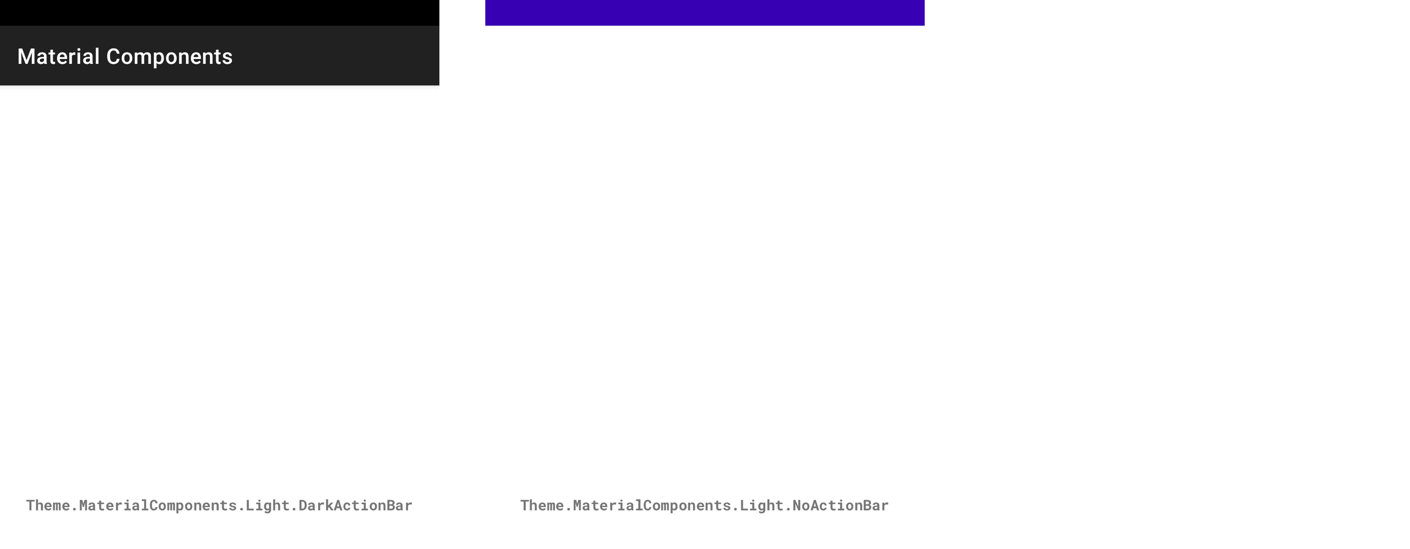
The key differences in each variant are the light/dark color palettes and the inclusion/exclusion of an
ActionBar in each themed Activity‘s Window. There exists DayNight variants of these for supporting automatic dark/light theming.
Note 1: If you are migrating an existing theme and don’t wish to get all of the new attributes at once, use a
Theme.MaterialComponents.*.Bridge variant.
Note 2: Some secondary variants are not shown here, such as
Theme.MaterialComponents.Dialog.* themes.
To start using one of these themes in your app, you’d add the following to your
res/styles.xml file:<style name="AppTheme" parent="Theme.MaterialComponents.*">
<!-- Add attributes here --></style>
Finally, you need to reference this in your Manifest:
<manifest
    ...>
    <application
        android:theme="@style/AppTheme">
        ...
    </application>
</manifest>
Note: You can also apply an
android:theme per <activity> in your Manifest.A simple playground screen 🎡
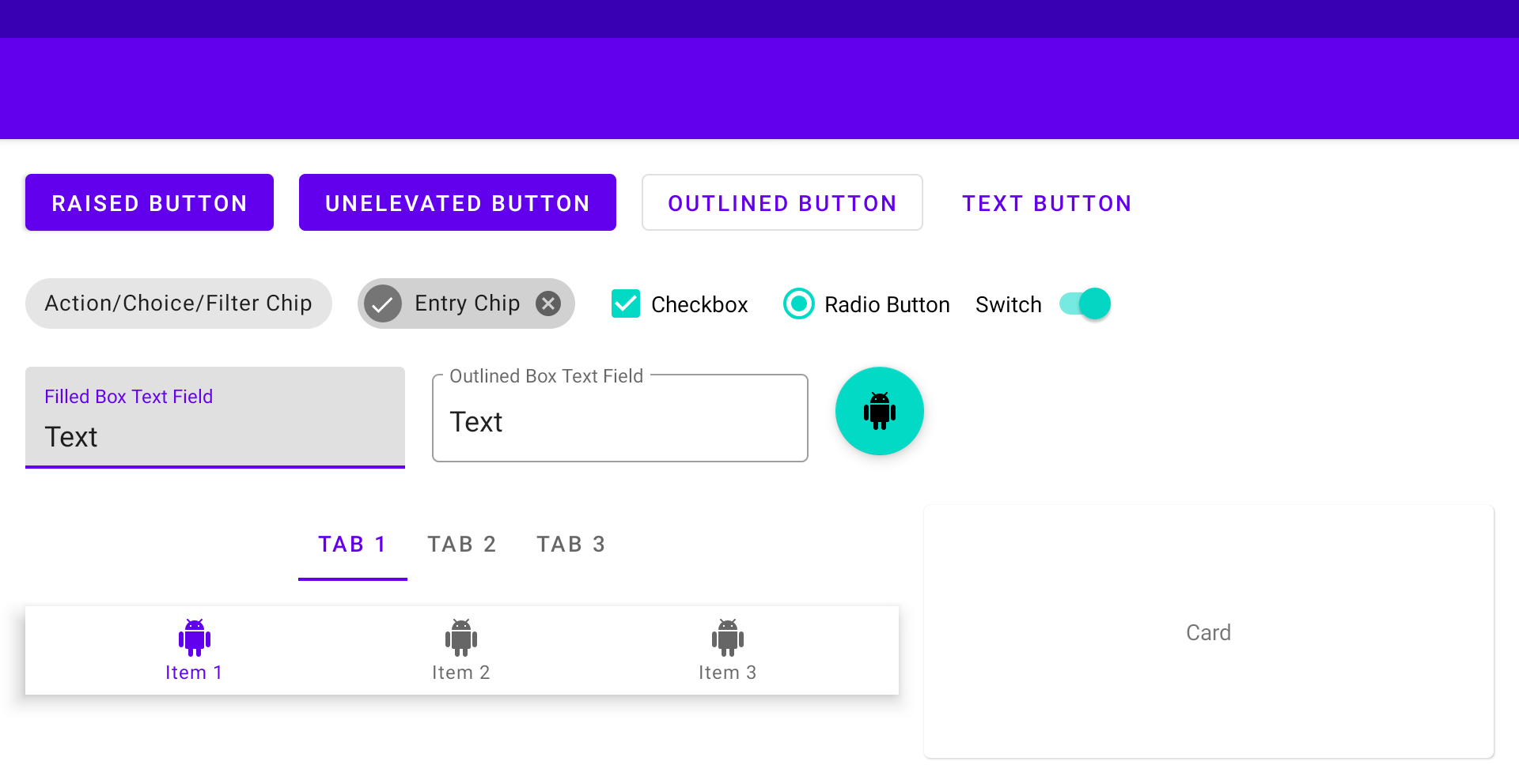
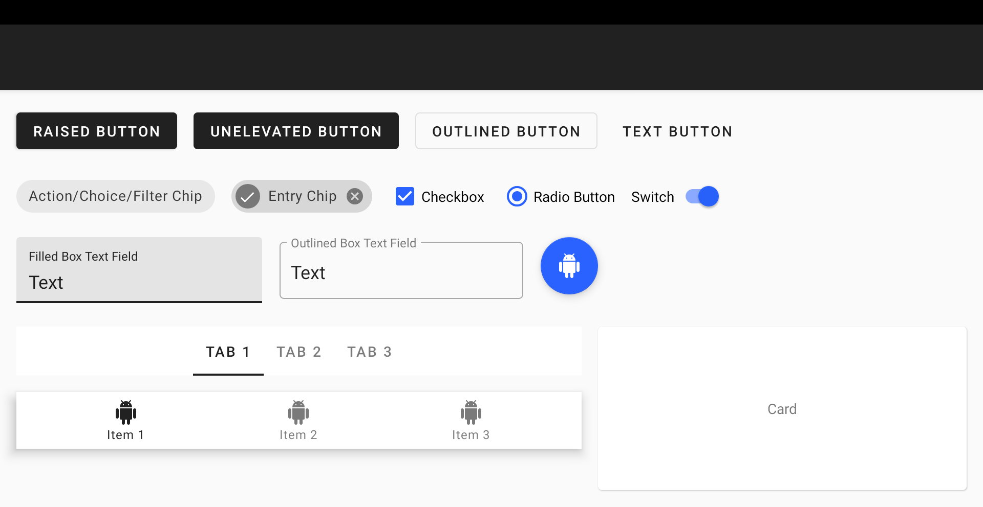
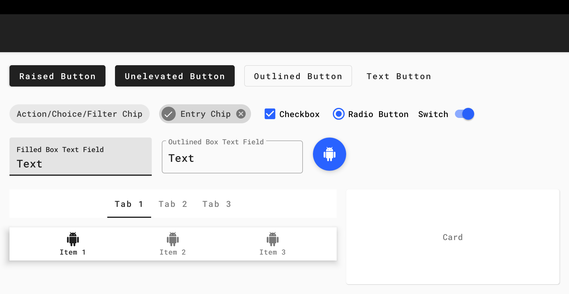
Right, time to get down to business. In order to illustrate the effects of customizing Material Components attributes, we need visual aid. We will be using the playground screen below, which uses the
Theme.MaterialComponents.Light base theme and is packed with most Material Components widgets and their variants:
Global theme attributes 🌍
The Material Components themes introduce new attributes that can be used to style elements on a global scale. These can be grouped into three main subsystems: color, typography and shape.
Color
Color attributes consist mainly of primary, secondary, error, surface and background colors, along with their respective secondary variants and “on” colors. Some of these have been reused from the AppCompat themes (eg.
colorPrimary, colorError and android:colorBackground):colorPrimary: The primary brand color of your app, used most predominantly in themingcolorPrimaryVariant: A lighter/darker variant of your primary brand color, used sparingly in themingcolorOnPrimary: The color used for elements displayed on top of your primary colors (eg. Text and icons, often white or semi-transparent black depending on accessibility)colorSecondary: The secondary brand color of your app, used mostly as an accent for certain widgets that need to stand outcolorSecondaryVariant: A lighter/darker variant of your secondary brand color, used sparingly in themingcolorOnSecondary: The color used for elements displayed on top of your secondary colorscolorError: The color used for errors (often a shade of red)colorOnError: The color used for elements displayed on top of your error colorcolorSurface: The color used for surfaces (i.e. Material “sheets”)colorOnSurface: The color used for elements displayed on top of your surface colorandroid:colorBackground: The color behind all other screen contentcolorOnBackground: The color used for elements displayed on top of your background color
These colors can be added to your app theme like so:
<style name="AppTheme" parent="Theme.MaterialComponents.Light">
    <item name="colorPrimary">#212121</item>
    <item name="colorPrimaryVariant">#000000</item>
    <item name="colorOnPrimary">#FFFFFF</item>
    <item name="colorSecondary">#2962FF</item>
    <item name="colorSecondaryVariant">#0039CB</item>
    <item name="colorOnSecondary">#FFFFFF</item>
    <item name="colorError">#F44336</item>
    <item name="colorOnError">#FFFFFF</item>
    <item name="colorSurface">#FFFFFF</item>
    <item name="colorOnSurface">#212121</item>
    <item name="android:colorBackground">@color/background</item>
    <item name="colorOnBackground">#212121</item>
</style><color name="background">#FAFAFA</color>
Note 1: Hex color codes are not currently supported for
android:colorBackground, hence why a color resource was used.
Note 2: Use
android:statusBarColor and android:navigationBarColor attributes to theme system bars.
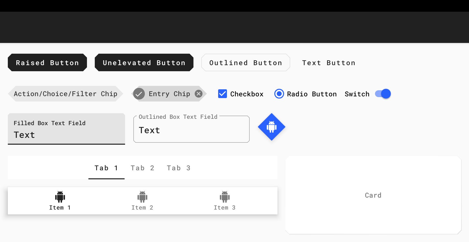
The result can be observed in our playground screen:

A great way to quickly preview the appearance of primary/secondary colors is to use the Material Color Tool.
Typography
Type attributes adhere to the Material Type System in terms of text typeface, weight, size, case and letter spacing. The attributes reference
TextAppearance.MaterialComponents.* styles that implement (and are named after) the various type scales:textAppearanceHeadline1: Light, 96sptextAppearanceHeadline2: Light, 60sptextAppearanceHeadline3: Regular, 48sptextAppearanceHeadline4: Regular, 34sptextAppearanceHeadline5: Regular, 24sptextAppearanceHeadline6: Medium, 20sptextAppearanceSubtitle1: Regular, 16sptextAppearanceSubtitle2: Medium, 14sptextAppearanceBody1: Regular, 16sptextAppearanceBody2: Regular, 14sptextAppearanceCaption: Regular, 12sptextAppearanceButton: Regular, 14sp, all capstextAppearanceOverline: Regular, 12sp, all caps
The Material Components widgets will use these styles as per the Material guidelines.
You would typically want to keep the default weight, size, case and letter spacing for each style. However, a custom typeface can really make your app stand out. One might assume this requires overriding each and every one of these attributes. Thankfully, this can be done in a far more concise way by adding the following attributes to your app theme:
<style name="AppTheme" parent="Theme.MaterialComponents.Light">
    ...
    <item name="fontFamily">@font/roboto_mono</item>
    <item name="android:fontFamily">@font/roboto_mono</item>
</style>
These attributes reference an XML Font or a Downloadable Font that you’ve added to your
res/font folder and will apply a custom typeface to every widget and text style in your app. There was certainly a time when it wasn’t this easy on Android!
If you do, however, wish to customize one of the Material Components text appearance styles, you would do so like this:
<style name="AppTheme" parent="Theme.MaterialComponents.Light">
    ...
    <item name="textAppearanceButton">@style/AppTextAppearance.Button</item>
</style><style name="AppTextAppearance.Button" parent="TextAppearance.MaterialComponents.Button">
    ...
    <item name="android:textAllCaps">false</item>
</style>
The results can be observed in our playground screen:

Lastly, Google Fonts is a great place to start if you’re looking for free-to-use, custom typefaces (which happen to work really well with Downloadable Fonts too).
Shape
Shape attributes refer to the general form of each surface and widget in your app. When you consider that these components can be of varying width/height and be raised/unelevated/outlined, this reduces down to one aspect of customization… Corners.
Material Components corners can either be part of the rounded (default) or cut
cornerFamily and have a cornerSize to customize the size. A treatment can be applied to all corners or a subset. The shape theme attributes reference ShapeAppearance.MaterialComponents.* styles:shapeAppearanceSmallComponent: For small components, such as Buttons and ChipsshapeAppearanceMediumComponent: For medium components, such as CardsshapeAppearanceLargeComponent: For large components, such as Bottom Sheets
The Material Components widgets will use these styles as per the Material guidelines.
If you wish to customize the Material Components shape appearance styles, you would do so like this:
<style name="AppTheme" parent="Theme.MaterialComponents.Light">
    ...
    <item name="shapeAppearanceSmallComponent">@style/AppShapeAppearance.SmallComponent</item>
    <item name="shapeAppearanceMediumComponent">@style/AppShapeAppearance.MediumComponent</item>
</style><style name="AppShapeAppearance.SmallComponent" parent="ShapeAppearance.MaterialComponents.SmallComponent">
    <item name="cornerFamily">cut</item>
    <item name="cornerSize">8dp</item>
</style><style name="AppShapeAppearance.MediumComponent" parent="ShapeAppearance.MaterialComponents.MediumComponent">
    <item name="cornerFamily">cut</item>
    <item name="cornerSize">8dp</item>
</style>
The result can be observed in our playground screen:

Widget styles and attributes 📱
While global theming covers the majority of our needs, there are times when we may wish to customize the attributes of individual widgets. We will explore the styles (and relevant attributes) of common widgets and how these can be referenced in your Material Components theme.
Buttons
Material Buttons include four main variants that all inherit from the base
Widget.MaterialComponents.Button style, each with an optional style suffix: raised (default, no suffix), unelevated (*.UnelevatedButton), outlined (*.OutlinedButton) and text (*.TextButton). All button variants use the textAppearanceButton theme attribute for their typography styles.
The key attributes for customizing these styles are as follows:
backgroundTint: The tint color applied to the button background. The default enabled color is transparent for text buttons andcolorPrimaryfor all other variants.iconTint: The tint color applied to an optional button icon. The default enabled color iscolorPrimaryfor text buttons andcolorOnPrimaryfor all other variants.rippleColor: The color of the button touch ripple. The default color iscolorOnPrimaryfor raised/unelevated buttons andcolorPrimaryfor outlined/text buttons.strokeColor: The color of the stroke around the button background. The default color iscolorOnSurfacefor outlined buttons and transparent for all other variants.strokeWidth: The width of the stroke around the button background. The default value is 1dp for outlined buttons and 0dp for all other variants.shapeAppearance: The shape appearance of the button background. The default value isshapeAppearanceSmallComponent.
The base button style (used by the
MaterialButton widget class) can be customized and applied globally like so:<style name="AppTheme" parent="Theme.MaterialComponents.Light"> ... <item name="materialButtonStyle">@style/AppButton</item> </style><style name="AppButton" parent="Widget.MaterialComponents.Button"> <item name="backgroundTint">?attr/colorSecondary</item> </style>
The result can be observed in our playground screen:


Text Fields
Material Text Fields include two main variants. As a result of porting the pre-existing AppCompat
TextInputLayout and TextInputEditText classes, there are in fact two base styles: Widget.MaterialComponents.TextInputLayout.* and Widget.MaterialComponents.TextInputEditText.*. The variants have a style suffix and include filled box (default, *.FilledBox) and outlined box (*.OutlinedBox). All text field variants use the standard text appearance for input and the textAppearanceCaption theme attribute for “helper” text (labels, errors, counters, etc.).
The key attributes for customizing the
Widget.MaterialComponents.TextInputLayout.* styles are as follows:boxBackgroundMode: The mode of the box background, which can be eitherfilled,outlineornone.boxBackgroundColor: The color of the text field background. The default enabled color iscolorOnSurfacefor filled box text fields and transparent for outlined box text fields.boxStrokeColor: The color of the stroke around the text field background. The default color iscolorOnSurface(in default state) for outlined box text fields and is ignored for filled box text fields.hintTextColor/errorTextColor/counterTextColor: Various colors for different “helper” text sub-components.shapeAppearance: The shape appearance of the text field background. The default value isshapeAppearanceSmallComponent.
The base text field style (used by the
TextInputLayout widget class) can be customized and applied globally like so:<style name="AppTheme" parent="Theme.MaterialComponents.Light"> ... <item name="textInputStyle">@style/AppTextField</item> </style><style name="AppTextField" parent="Widget.MaterialComponents.TextInputLayout.FilledBox"> <item name="boxBackgroundColor">@color/text_field_background</item> </style>
Note:
text_field_background is a res/color <selector> that uses colorSecondary and the same alpha values as the default boxBackgroundColor <selector>.
The result can be observed in our playground screen:


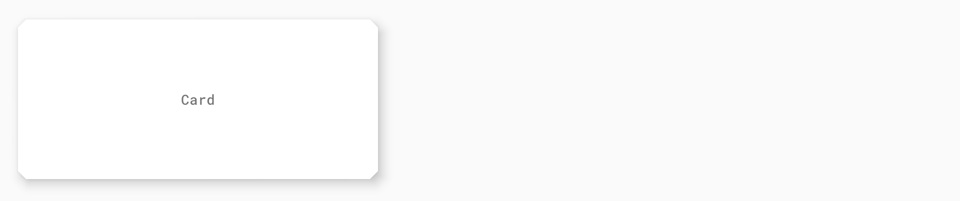
Cards
Material Cards are considered to be “surfaces” and make use of the
Widget.MaterialComponents.CardView style. The key attributes for customizing them are as follows:cardBackgroundColor: The color of the card background. The default color iscolorSurface.cardElevation: The elevation of the card. The default value is 1dp.shapeAppearance: The shape appearance of the card background. The default value isshapeAppearanceMediumComponent.
The base card style (used by the
MaterialCardView widget class) can be customized and applied globally like so:<style name="AppTheme" parent="Theme.MaterialComponents.Light"> ... <item name="materialCardViewStyle">@style/AppCard</item> </style><style name="AppCard" parent="Widget.MaterialComponents.CardView"> <item name="cardElevation">8dp</item> </style>
The result can be observed in our playground screen:

Bottom Navigation
Material Bottom Navigation includes two main variants that inherit from the base
Widget.MaterialComponents.BottomNavigationView style, with an optional style suffix: surface (default, no suffix) and colored (*.Colored). Bottom Navigation labels use the textAppearanceCaption theme attribute for their typography styles.
The key attributes for customizing these styles are as follows:
backgroundTint: The color of the bottom navigation background. The default color iscolorSurfacefor surface bottom navigation andcolorPrimaryfor colored bottom navigation.itemTextColor/itemIconTint: The colors of bottom navigation item icons and labels. The default colors arecolorOnSurface/colorPrimary(selected) for surface bottom navigation andcolorOnPrimaryfor colored bottom navigation.itemHorizontalTranslationEnabled: A flag to set whether or not a translation animation should occur when selecting bottom navigation items. The default value is false.
The base bottom navigation style (used by the
BottomNavigationView widget class) can be customized and applied globally like so:<style name="AppTheme" parent="Theme.MaterialComponents.Light"> ... <item name="bottomNavigationStyle">@style/AppBottomNavigation</item> </style><style name="AppBottomNavigation" parent="Widget.MaterialComponents.BottomNavigation.Colored" />
The result can be observed in our playground screen:


This is certainly not exhaustive. A more comprehensive list of all components and their attributes can be found in the Material Components for Android Docs.
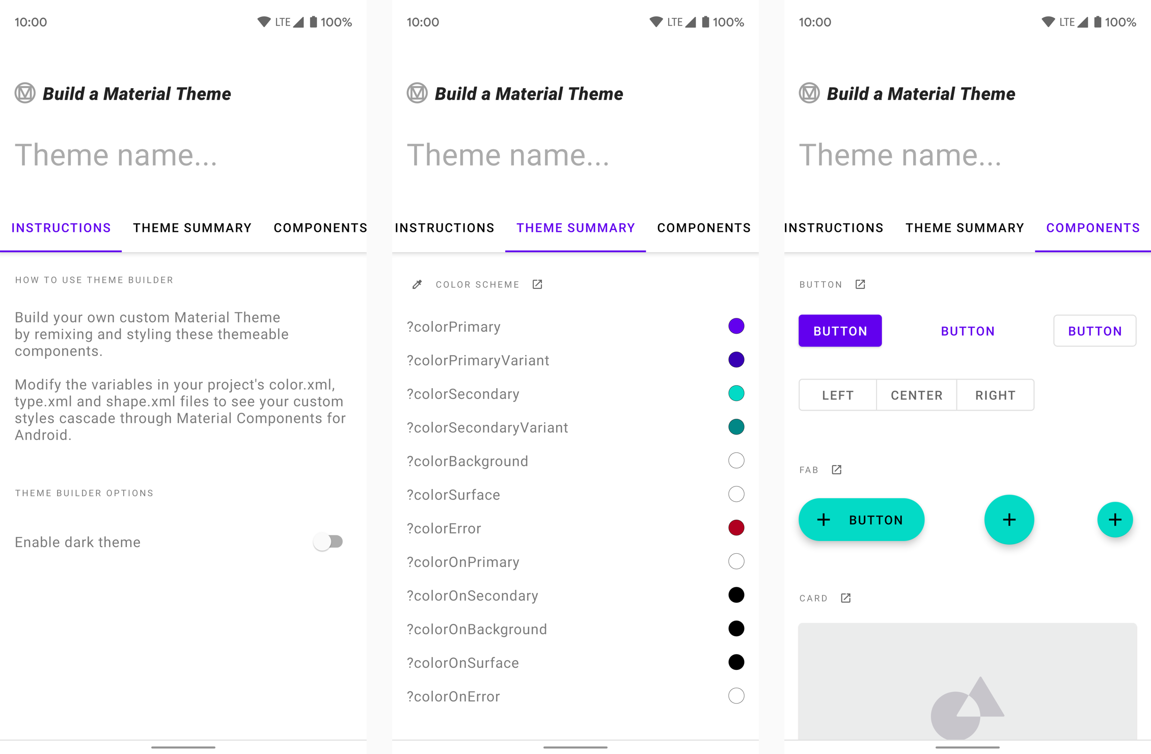
Build a Material Theme
The Material Components for Android library includes a module that allows you to easily customize an existing Material Theme. It provides you with a set of XML files (
color.xml/night/color.xml, type.xml and shape.xml) which include all of the necessary baseline theme attributes mentioned in this article. The values can be tweaked and previewed in a corresponding sample app. When you’re happy with the chosen values, the files can be dropped into a new/existing Android Studio project. A web version is also available on Glitch.
More resources 📚
- The source code for the Playground app used in this article can be found on GitHub
- “The Components of Material Design” - A great presentation by Cameron Ketcham and Gautham Sajith at Android Dev Summit 2018, covering a brief history of Material Design and how to use Material Components for Android
- “Designing and building a real Android app using Material Tools & Components” - A presentation I gave at Droidcon Kenya and DevFest South Africa 2018, covering how I designed and built Rugby Ranker using the Material Theme Editor Sketch Plugin, Material Gallery and, of course, Material Components for Android
- Material Design Codelabs
I hope this post has provided some insight into theming your app using Material Components for Android. If you have any questions, thoughts or suggestions then I’d love to hear from you!


